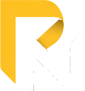
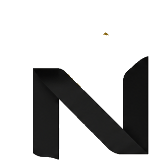
The mark, assembling. Reload the page to watch it fold into place.
Brand identity · Self-initiated · 2026
One ribbon, folded once, forms both letters of my initials. The fold isn't decoration — it's the whole system.
The mark, assembling. Reload the page to watch it fold into place.
The problem
A designer's personal mark carries an awkward burden: it's the first piece of work anyone sees, and it's judged before they've read a word about you. Set your initials in a nice typeface and you've said nothing. Overwork them and you've said too much.
I went through several rounds of geometric monograms — interlocked letters, negative space, colour splits. They were competent and completely forgettable. Nothing in them explained how I think.
What I actually do all day is take flat things and give them dimension — folding, scoring, trimming, proofing. The mark should do the same.
The idea
One continuous band turns back on itself. The upstroke and bowl read as a P; where the ribbon folds and descends, it becomes the diagonal and stem of an N. Neither letter is drawn separately — they're two states of the same piece of material.
The yellow face and the shadowed black face are the same ribbon seen from two sides. That's what separates the letters — not an arbitrary two-tone treatment. It also means the mark still reads when it collapses to a single colour.
Cropped into a rounded tile, the mark becomes an app icon and favicon without redrawing. The silhouette is distinct enough to survive at 32 pixels — the real test for any personal mark in 2026, where most people meet it as an avatar.
The fold angle carries into everything else: the corner treatment on project cards, the rule that opens each section, the way thumbnails crop. Nothing is decorated — the same move repeats at different scales.
Behaviour
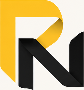
Primary — full colour on off-white
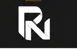
Reverse — one colour on charcoal

Icon — square tile for avatars and favicons
Motion
On load, the yellow face wipes in from the left and the folded black face drops in behind it, 200 milliseconds later. The whole thing settles in about 0.7 seconds — enough to register as a fold, short enough that nobody waits for it.
The animation respects
prefers-reduced-motion; if you've asked your system to minimise motion,
the mark simply appears.
System
Yellow carries the identity; charcoal grounds it; the off-white keeps everything off pure white, which reads warmer in print and on screen. Sage appears sparingly — section rules, employer names — so the yellow never has to compete for attention.
System
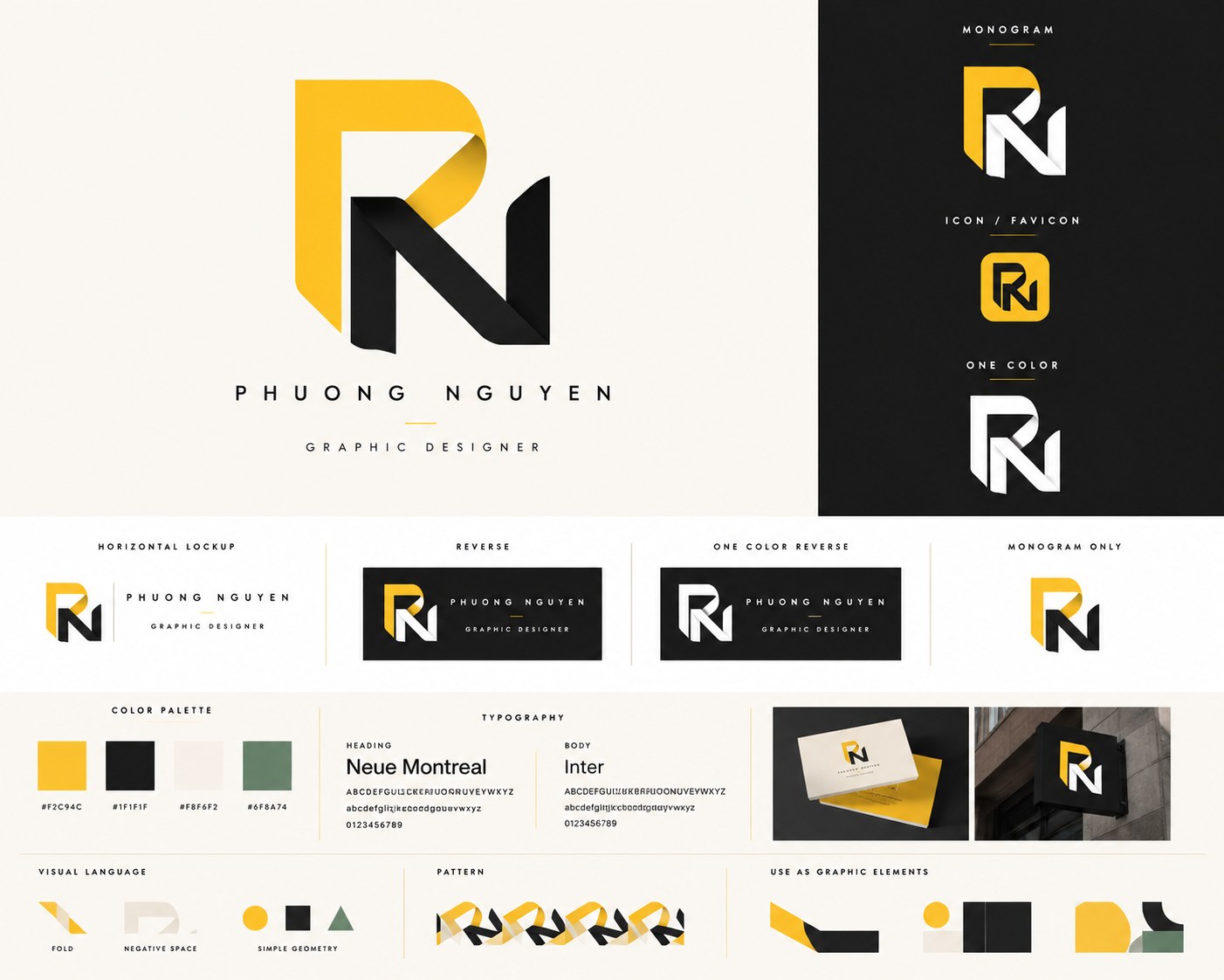
Monogram, icon, one-colour, horizontal lockup, reverse, palette, type and the fold-derived graphic elements.
Reflection
The mark currently exists as artwork rather than as a drawn-from-scratch vector with a construction grid. The next step is rebuilding it on a defined geometry — fold angle, ribbon width and corner radius all derived from one ratio — so it can be reproduced exactly at any scale, and so the fold angle can be specified rather than eyeballed.
Beyond that: a physical test. This identity argues for paper, and it should be proved on a press — a folded business card where the score line sits exactly where the ribbon turns.
Next project
Contact
Based in San Jose, working across brand, print and digital.